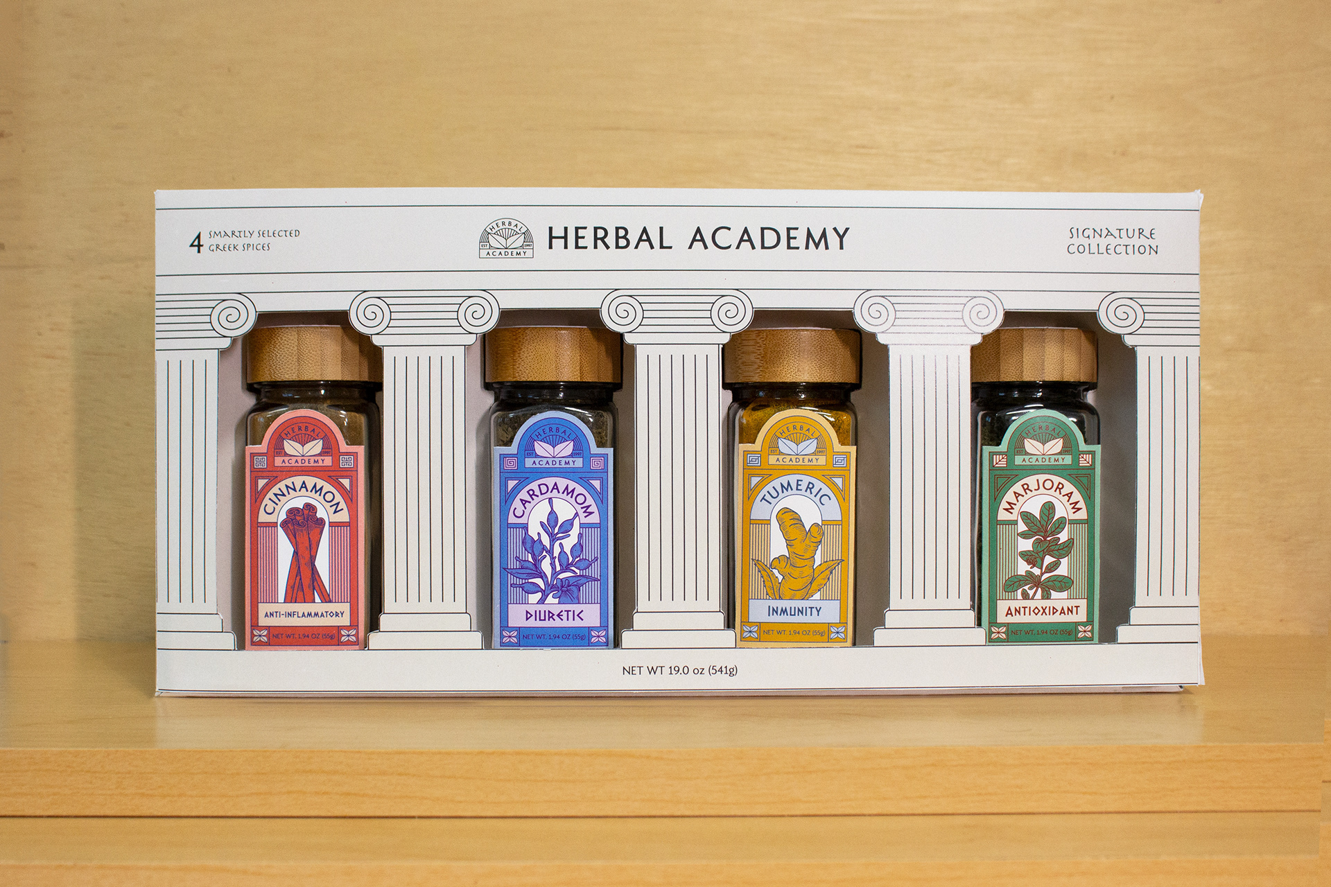
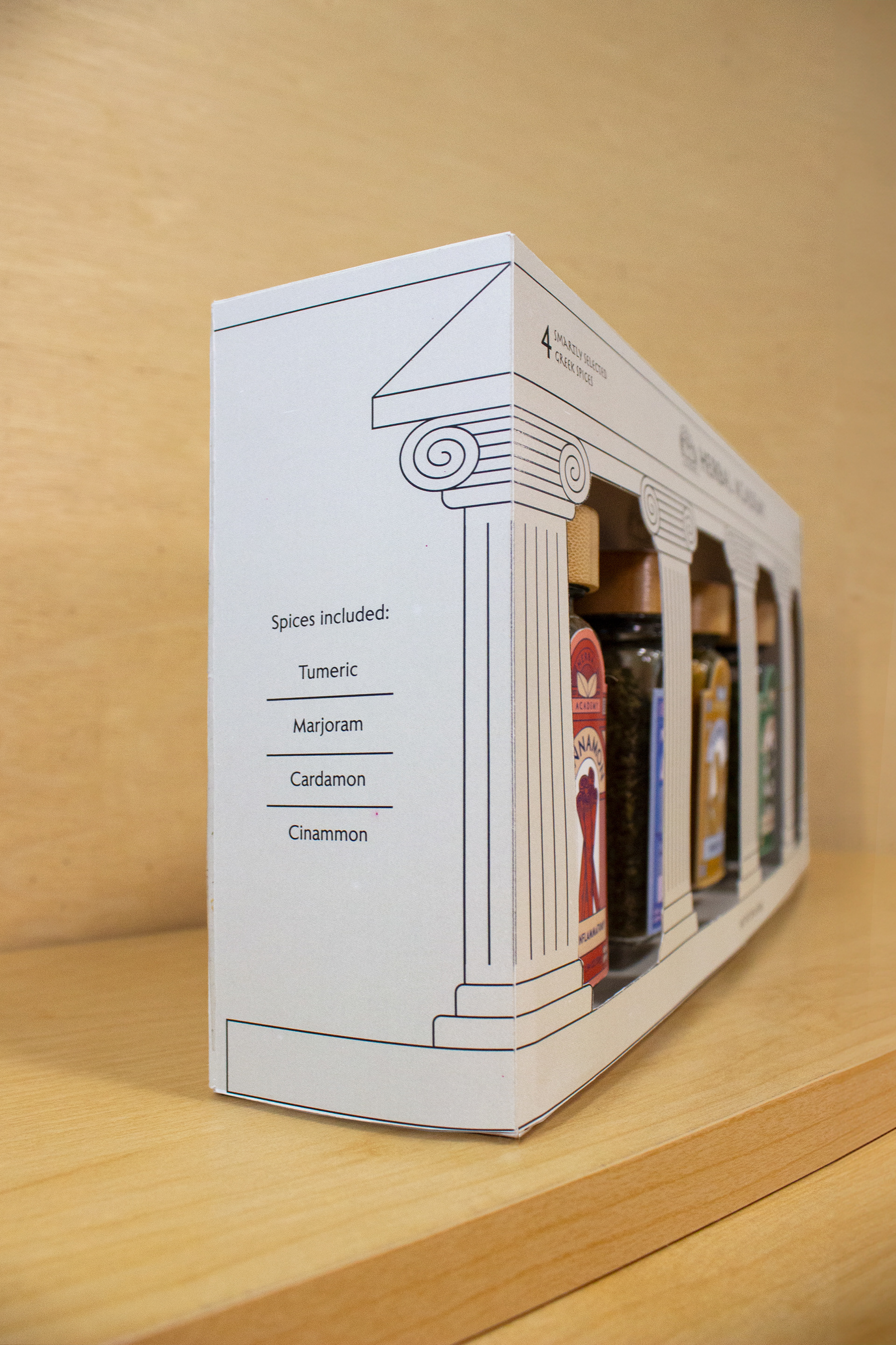
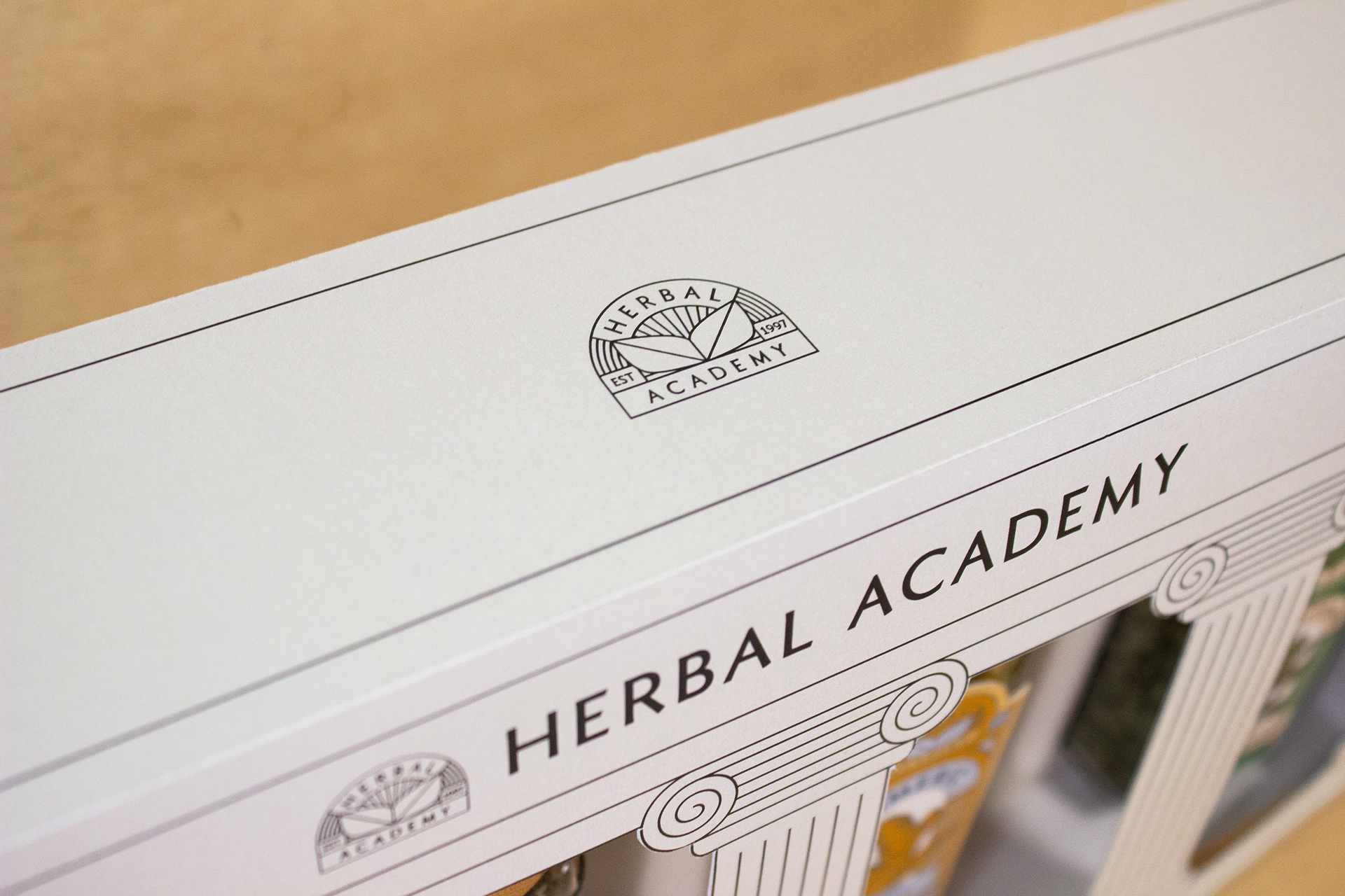
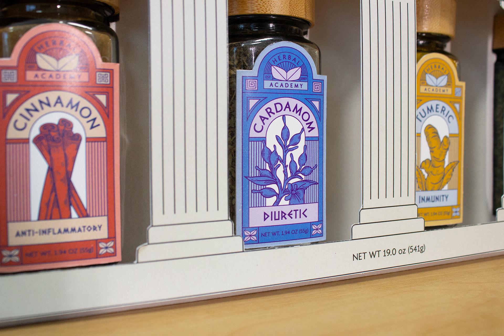
This concept emerged from a recognition that while we commonly appreciate spices for their culinary uses, their health benefits are often overlooked. Thus, the idea was conceived to offer a sophisticated, Greek-inspired spice set that not only elevates flavors but also educates about their health advantages. The brand name, Herbal Academy, cleverly directs attention to the spices with a medical undertone and ties back to the Greek concept, emphasizing its educational mission. The inclusion of two leaves in the logo symbolizes an open book, reinforcing the educational aspect. Additionally, the spice labels are designed to be symmetrical, featuring spice illustrations to balance the symmetry and add visual interest. As for the box, a gray hue with a hint of yellow was chosen to complement the wooden lids of the bottles and evoke the imagery of construction and stone, aligning with the Greek-inspired theme.
